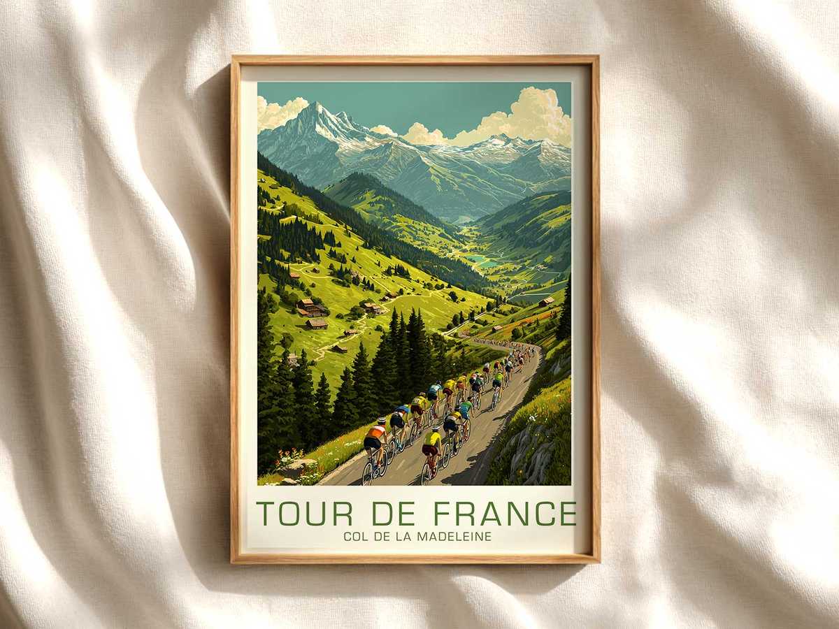
The Col de la Madeleine occupies a special place in Tour iconography: high Alpine hairpins, tree-lined approaches and high-altitude pastures form a postcard landscape that immediately situates any image in the French Alps. When a poster chooses that pass as its frame and places the bicycle at foreground center, the mountain becomes more than setting — it is the stage that amplifies the machine’s visual personality. This article reads such a poster through the bike’s lines, cockpit and race posture to show how the bicycle asserts itself as an object of precision while remaining decorative and display-worthy.
First, consider silhouette. Against the Madeleine’s sweeping curves and striping of road and meadow, a racing frame cuts a taut, architectural shape. The geometry of the top tube, seat tube and slender fork creates intersecting lines that echo the long contours of alpine roads. This structured silhouette functions like a signature: it defines the bike’s character without technical spec-sheets. In an interior, that confident silhouette reads as an emblem of craft and purpose — neat, recognisable and immediately legible from across a room.
Wheels and mechanical rhythm are the poster’s punctuation. Circular forms of the rims and the negative spaces they create contrast with the landscape’s horizontal bands, giving the composition a visual heartbeat. Even when spokes and drivetrain details are simplified for print, the wheel pair anchors the bicycle in motion and balance. The viewer interprets that compact mechanical geometry as precision engineering; the artwork translates performance cues into decorative clarity.
Equally important is the cockpit and its implied control. Handlebars, stem and tape, even when reduced to clean graphic elements, point the machine’s intent down the road. The cockpit becomes a visual promise of responsiveness: a focused, forward-looking axis that aligns rider and machine with the slope ahead. In a Madeleine poster, the cockpit’s orientation against the high mountain backdrop heightens the sense of ascent and exactness — the bike is not merely parked, it is poised.
[IMAGE_INSERT_ARTICLE_01]
Race posture, whether shown with a rider or suggested by saddle height and handlebar reach, completes the reading. A compressed, aerodynamic pose or the suggestion of a climb-ready position communicates discipline and calibration; it tells the viewer the machine has been tuned for purpose. Here, posture functions as narrative shorthand. It transforms the bicycle from decorative motif into protagonist: the object that carries technique, memory and the drama of the Madeleine climb.
Viewed within an interior — an office, garage, studio or reading room — this type of poster performs on two levels. It decorates through compositional harmony and Alpine scenic cues tied to Col de la Madeleine, a recurring and visually iconic Tour climb. Simultaneously, it offers a focused study of mechanics and design: frame angles, wheel geometry and cockpit alignment become the room’s quiet statements about precision and practice. The result is a piece that is both beautiful and meaningfully specific to cycling culture.
Finally, such imagery holds collector appeal because it links place and machine. The Madeleine’s status in Tour history and its postcard landscapes give the print geographic and cultural weight, while the bike’s precise visual language supplies an emotional, craft-focused anchor. For anyone arranging cycling wall hangings, a poster that foregrounds the bicycle at Col de la Madeleine offers a compelling mix of decorative calm and technical admiration — a piece that looks as good on a wall as it reads as an ode to performance.