There is a particular hush that settles over a room when a vintage Tour de France poster connected to Nice is placed on the wall. It is not only the bright sweep of Mediterranean light or the immediately recognisable silhouette of an old steel frame; it is the way the image carries a layered memory — local streets, seaside promenades, the small civic pride of provincial towns — and turns a sporting scene into a piece of cultural weather. Read as heritage rather than mere sports advertising, the poster becomes an object that converses with its surroundings: with timber furniture, leather-bound books, and the quiet geometry of a study or reading room.
The archival quality of such a poster is central to that effect. Printed inks that have softened, paper that shows the faintest toning at the edges, halftone dots that still reveal the human hand of early printing — these are cues our eyes recognise as authenticity. They carry implied narratives: seasons of sun and rain, hands that folded and re-folded the sheet, collectors who framed the print and passed it on. When the subject is Nice, those tactile signals mingle with place: the curve of a coastal road rendered in warm ochre, a palm shadow suggested rather than strictly drawn, a classic jersey whose fabric seems palpable. This is not nostalgia for its own sake; it is material memory, and that materiality makes the poster work in interiors as more than decoration.
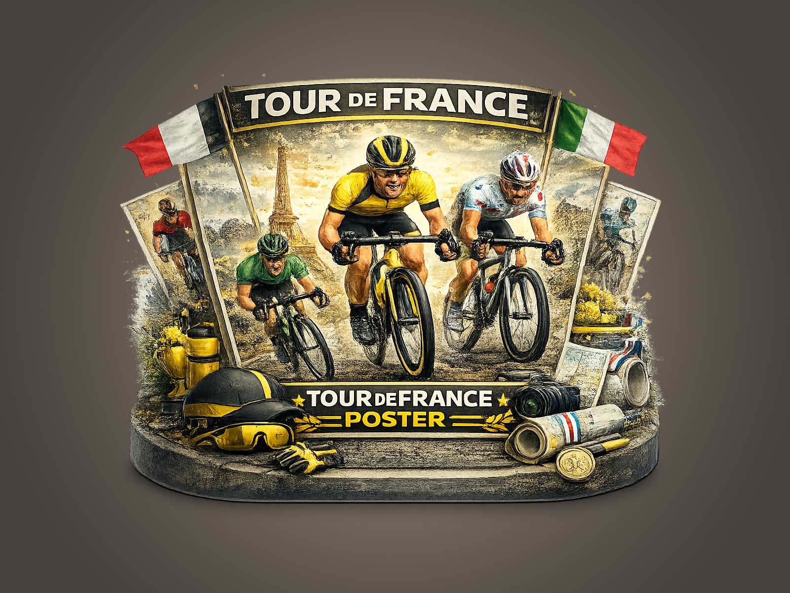
[IMAGE_INSERT_ARTICLE_01]
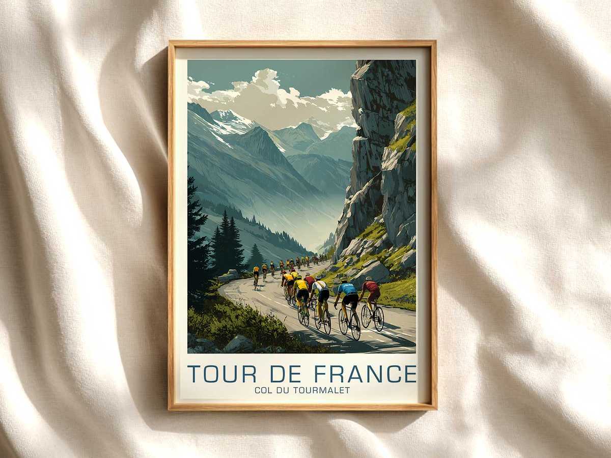
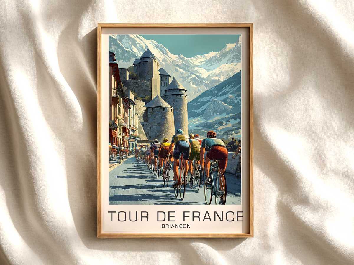
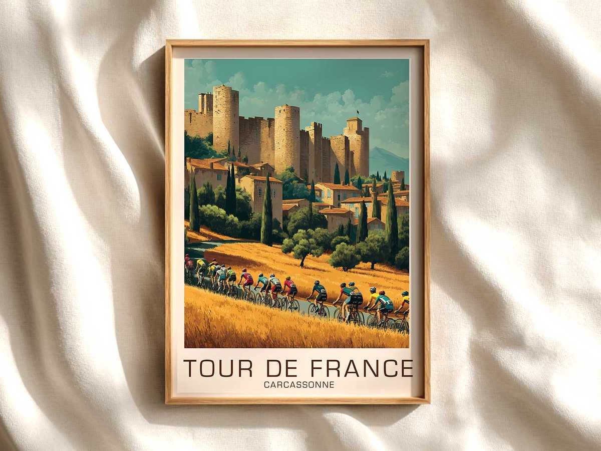
Iconography matters. The older visual language of the Tour — narrow handlebars, tubular tyres, wool jerseys with simple stripes, the cyclist's lean profile — reads like a distilled grammar of the sport. These forms are shorthand for continuity: they remind the viewer that cycling is built from generations, from small teams and roadside crowds to grand spectacle. In a domestic or professional interior this shorthand functions like a signpost to a deeper cultural story. A collector will recognise the quiet authenticity of the bike and jersey, but even a general viewer senses a dignified past, which lends the room an atmosphere of calm seriousness and tasteful curiosity.
Another reason heritage-led Tour imagery feels inherently decorative is the way it negotiates scale and composition. Vintage posters often place the rider in relation to landscape — a bend of road, a promontory, an urban façade — so the human figure becomes both protagonist and element of a larger vista. That compositional generosity allows the print to breathe on a wall: it can anchor furniture, sit above a sideboard, or hang beside a bookshelf without competing for attention. The image's patina and restraint prevent it from clashing with modern interiors; instead it offers a warm counterpoint to contemporary minimalism.
Collectors prize such posters not simply for rarity, but for the layered associations they carry: civic festivals, municipal pride, the smell of petrol and tar on a summer morning, the chatter of markets as riders sweep by. When framed and displayed, the poster performs as a curated memory — a cultural artefact that asserts taste and curiosity rather than loud fandom. That is why heritage Tour wall art often occupies places where thoughtfulness is valued: studies, studios, libraries, and boutique offices where visual restraint matters as much as passion.
Ultimately, a Tour de France poster linked to Nice works because it is legible on several levels at once. It reads as a weathered document, as an object of design, and as a mnemonic for place and sport. Its decorative strength comes from this layered meaning: the print’s surface texture and era-specific costume signal authenticity; its iconography signals continuity; and its sense of place offers intimate regional identity. For anyone looking to add a poster to a living space, choosing an image that foregrounds heritage over gimmick gives the piece a depth that lasts — aesthetically, culturally and emotionally.