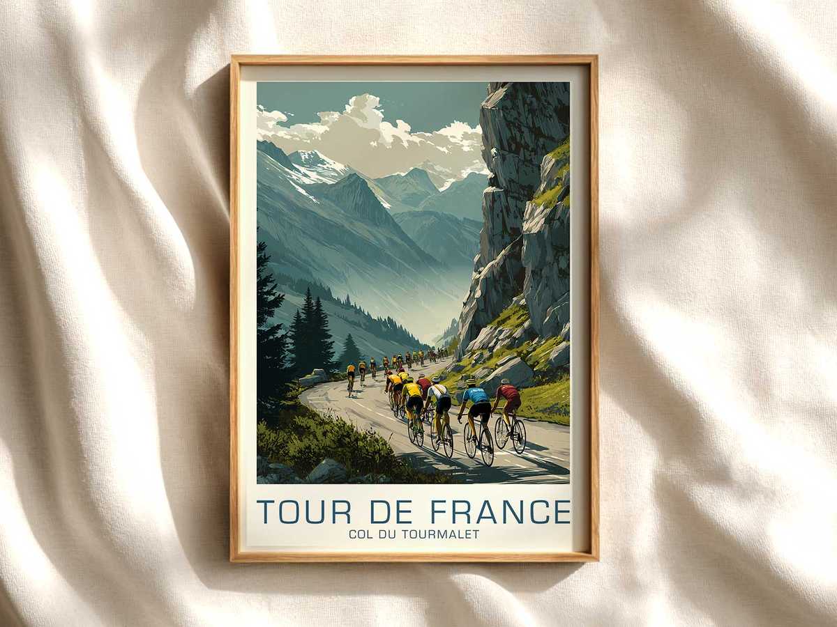
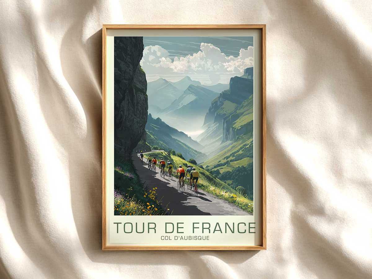
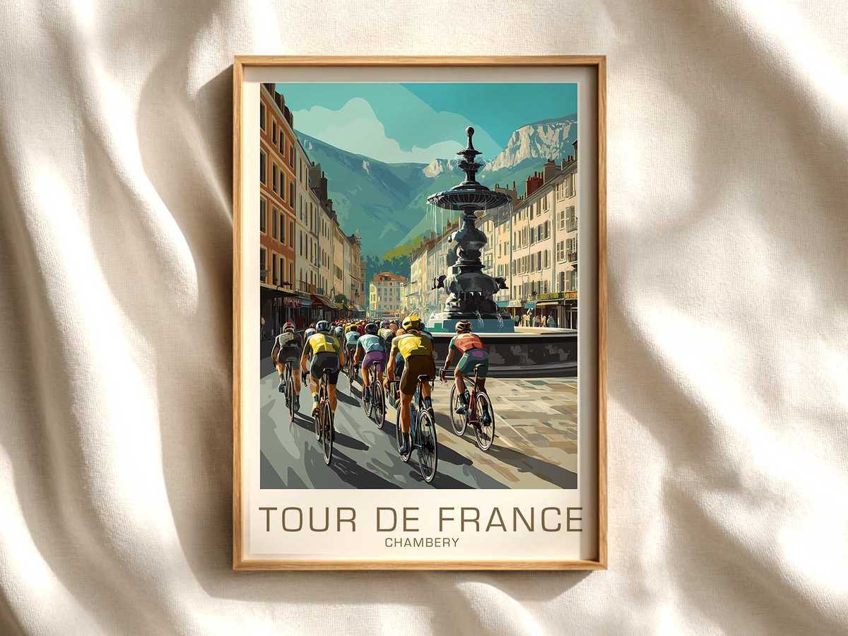
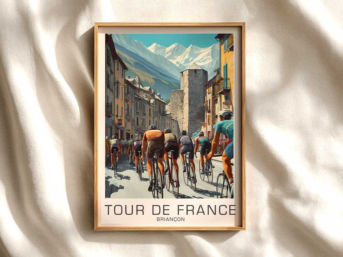
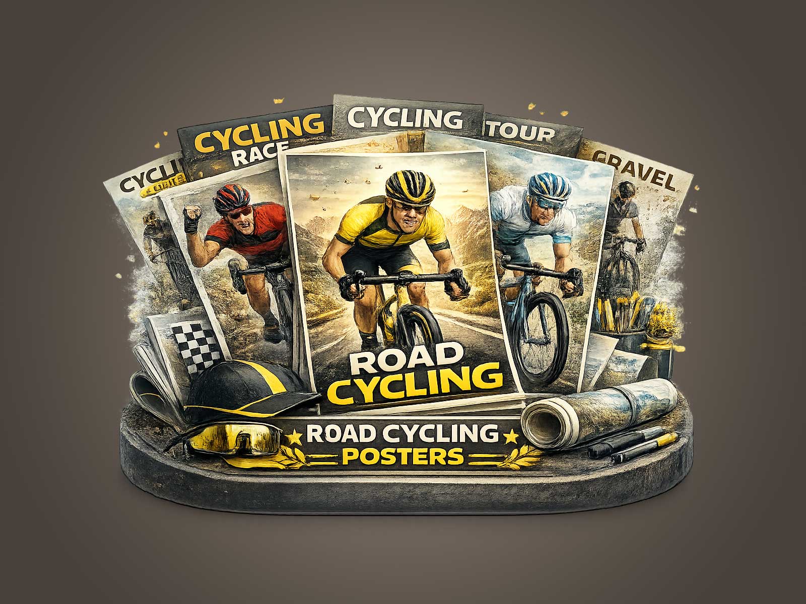
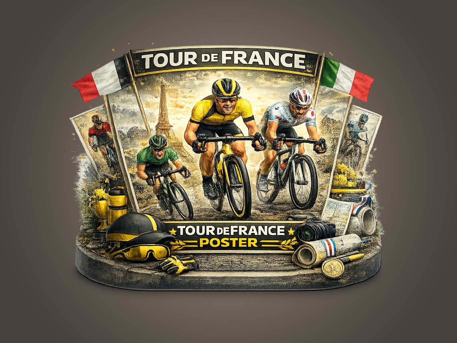
An affiche that links Bordeaux to the Tour de France does more than depict a race: it summons a layered memory where place, practice and printed matter respond to each other. The first thing a careful eye notices is the texture — the sun-washed paper tones, the soft edge of letterpress text, the faint hairlines of an old lithograph — all the small signs that this is a surface that has lived. Those tactile cues cue a viewer’s imagination: cobbled streets, river light, the measured pace of a peloton passing a provincial façade. In such a poster, local identity and cycling culture fold into one another until the image reads as civic memory rather than mere event advertising.
What makes a Bordeaux-linked Tour poster feel authentically historic is not only subject matter but the evidential marks of age. Slightly muted inks, a palette limited by the printing technology of the time, and the silhouette of older bicycles and classic jerseys create an instant temporal anchor. A wool jersey or downtube shifters are not costume; they are visual shorthand that places the viewer inside a lived continuity of the sport. The archival aesthetic — micro-cracks in the print, occasional foxing, and carefully restrained color fading — becomes a language of trust: it tells us this image has been looked at, cared for, and remembered.
The poster’s decorative value grows from that trust. In interiors, a heritage Tour image reads differently from contemporary graphics. Contemporary work often competes for attention with bold typography and hyper-saturated color; a vintage-style Tour image invites quiet attentiveness. It establishes a tone: a study, a library, a living room or a creative studio where objects are chosen for depth. The Bordeaux frame — whether suggested by a quay, a cathedral silhouette, or the curve of a riverside road — adds local specificity that makes the piece feel like a story told about a place, not just a race. This rootedness is what lets the poster bridge sport and home, turning cycling history into a civic keepsake.
There is also a narrative economy in archival cycling imagery. A single composition can carry seasonality, atmosphere, and social history: the forms of bicycles, the cut of jerseys, the crowd’s posture along a town square. Those elements act as cues for memory, even when the viewer has not personally witnessed that moment. We project family ties, regional pride, and the ritual of Sunday rides onto the scene. For collectors and design-minded owners, this is vital. The poster becomes a node in a wider cultural network — something that resonates with provenance, with the collector’s own stories and with the deeper mythos of the Tour.
[IMAGE_INSERT_ARTICLE_01]
Seen on a wall, the poster performs quietly. It invites conversation rather than declaring a slogan. Its palette and grain harmonize with wood, leather and book spines; its subject matter adds movement to otherwise static interiors. For those who curate spaces around authenticity, a vintage Bordeaux-Tour image is not decorative frippery but an anchoring object: it signals connoisseurship, narrative depth and a tasteful regard for sporting life as cultural heritage. That is why such images often feel more display-worthy than novelty sport prints — they offer a sense of continuity, belonging and well-aged taste.
Finally, the appeal of heritage-led cycling art is practical as well as emotional. The measured composition common to classic posters makes them easy to place; their restrained colorways lend themselves to framing choices that age gracefully. For anyone seeking wall art that rewards repeated looking, a Bordeaux-linked Tour poster crystallizes era, place and practice into a single, decorative artifact. It is a picture that hangs not to simply celebrate a winner but to keep a memory alive: of roads lined with towns, of machines that are almost furniture, and of a sport that has always been as much about place as it is about speed.