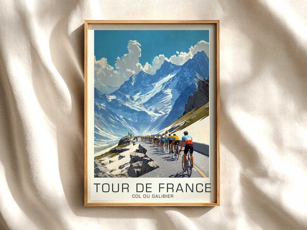
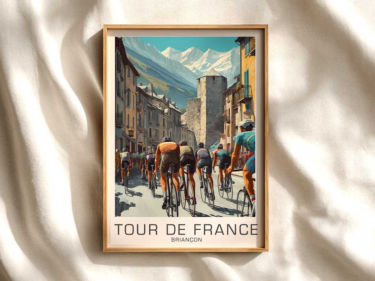
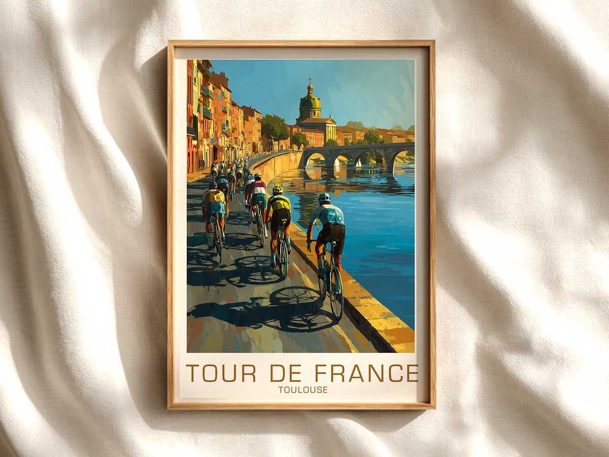
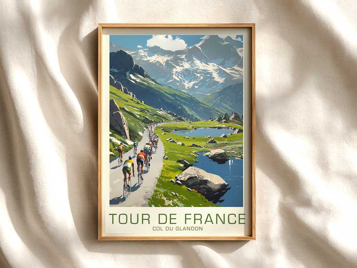
A poster that borrows its compositional heart from Carcassonne is more than a decorative nod to place; it becomes a small museum of memory. Muted ochres, sun-faded greens and a palette just short of saturation signal time passing—those slightly crushed tones create an immediate sense of age without needing explanation. The scene reads like a recovered photograph: sky washed by summer dust, stone ramparts softened by a film of atmospheric haze, and a peloton reduced to geometry and gesture. This is how the Grand Boucle survives as image and object, where visual memory matters as much as the racing myth.
What gives this kind of poster its authority is texture. Printed on uncoated or slightly toothy stock, the ink sits in the paper rather than on it, so colors breathe and edges fuzz in a way that convinces the eye the object has lived. Halftone grain, gentle surface abrasion effects, and selective fading mimic decades of handling and sunlight. Those treatments do more than simulate age; they invite touch and proximity. Mounted on a study wall or above a reading chair, the image behaves like an heirloom—a thing that will gather further patina and personal stories as it hangs.
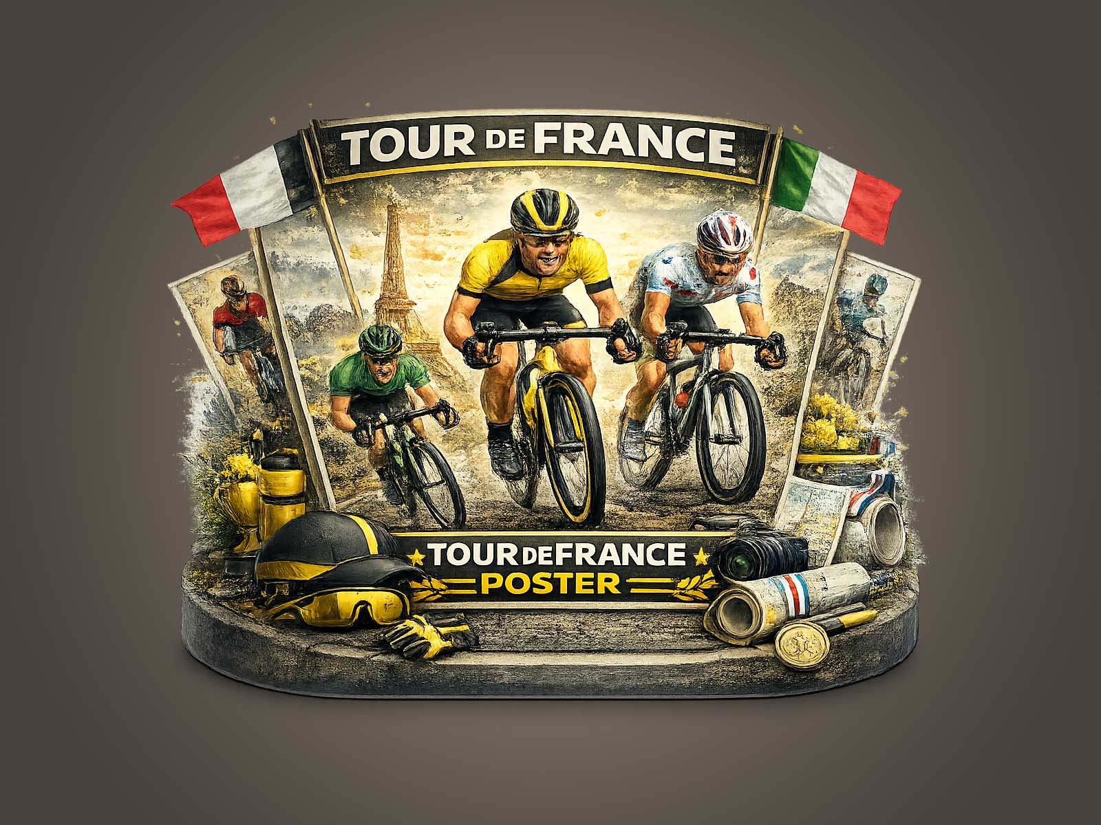
Iconography plays a quiet but crucial role. Classic jerseys, simplified bicycle silhouettes with steel frames and exposed braze-ons, the narrow handlebars and toe-strapped shoes—these details anchor the composition in cycling’s material culture. They are shorthand for the sport’s continuity: equipment that looks like it could belong to a grandfather’s race cabinet or to a museum vitrine. Unlike contemporary photographic realism, which records a moment, the Carcassonne-inspired composition suggests a lineage. The viewer recognizes equipment and pose, and the brain supplies the rest: history, rivalry, the cadence of long climbs and dusty descents.
[IMAGE_INSERT_ARTICLE_01]
There is an emotional economy to how these posters work. They trade spectacle for recollection. A solitary lead rider framed against a medieval wall, or a small group turning a sunlit corner, prompts narrative without spelling it out. The image asks you to remember races you never saw, to imagine weathered crowd lines and the hum of tubulars on cobbles. That imagined history is precisely what makes the work decorative in more than a surface sense: it connects the room to a cultural story, granting the space a lived-in dignity that a purely trendy print cannot match.
Collectors respond to that doubled life—image as memory and object as artifact. Editions printed with archival inks, limited runs, and numbered embossing transform a poster into a collectible. Even without rarity claims, the visual language of archival design encourages careful placement: libraries, offices, studios and corridors benefit because the art both anchors and tells. It suggests taste, an interest in provenance, and an appreciation for texture over gloss. For interiors seeking warmth and narrative, a heritage Tour image functions like a small conversation starter: the viewer asks where it came from, what race inspired it, and whether the colors once sang brighter on a race-day sky.
Finally, the decorative power of such a poster lies in restraint. By muting color and referencing age, the composition avoids kitsch and theatricality. It offers a calm punctuation to a room’s palette and a sophisticated recollection of cycling’s rituals—feeding stations, team radios silent in the image, handlebars tilted toward an unseen summit. The result is an object that looks at home amid leather-bound books and timber shelves as naturally as it complements a modern loft’s pared-back aesthetic. Heritage Tour wall art does not simply mimic the past; it curates a feeling of continuity that rewards repeated looking, quietly deepening the room’s story with each return gaze.