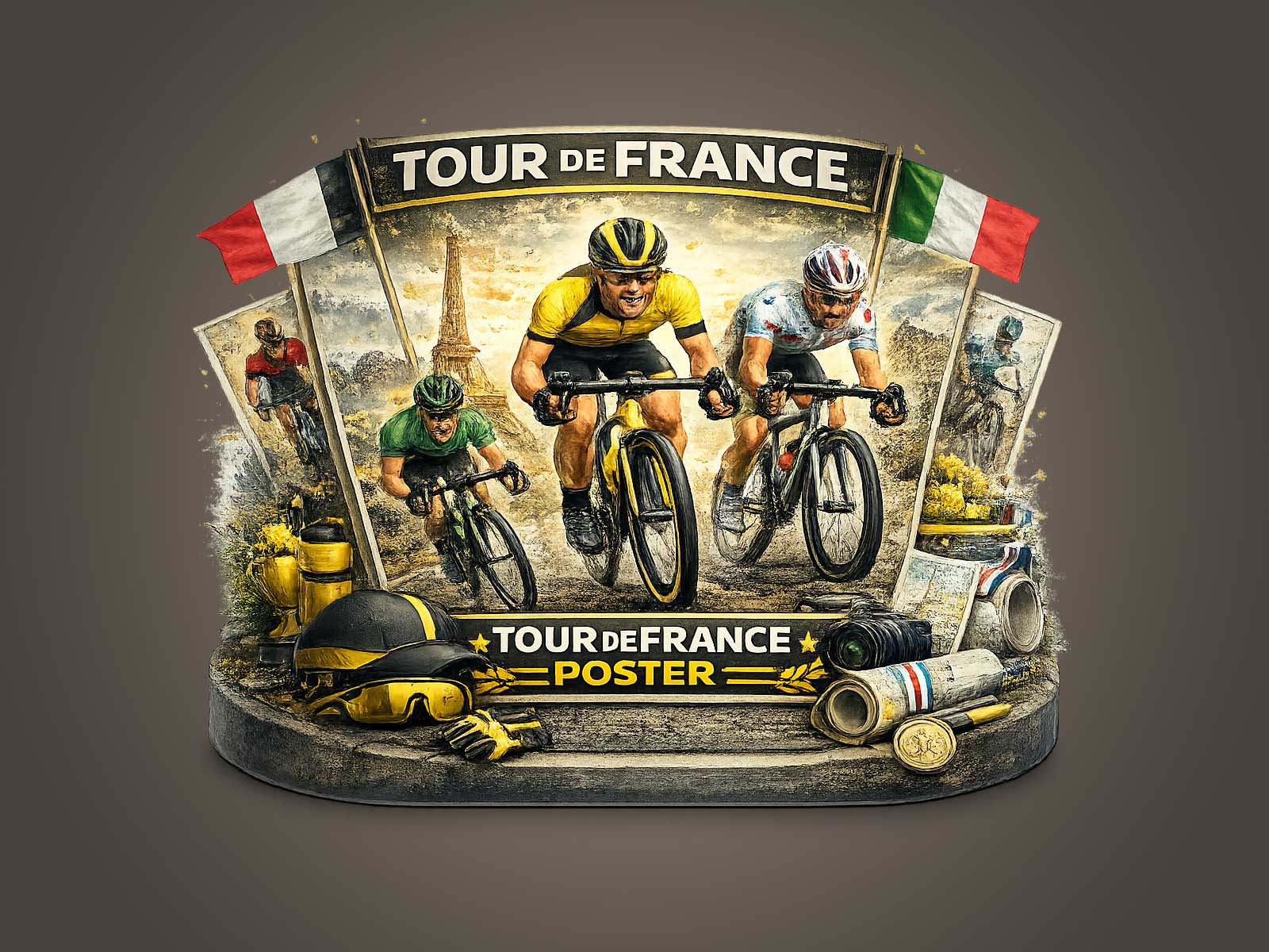
There is a specific pleasure in a vintage Tour de France poster that names a place like Saint-Étienne: it reads first as local memory, then as cycling legend. The image’s worn paper, softened colors and period typography do more than imitate nostalgia; they map a cultural conversation between a city, its industrial past and the long arc of cycling. Seen on a wall, this kind of poster acts like a lens into time—an invitation to trace a route where community, craftsmanship and competition meet.
What makes a Saint-Étienne–linked poster feel authentic is its archive language: matte inks that have lost a little saturation, an uneven print texture suggesting lithography, and a composition that privileges human scale over glossy spectacle. Classic jerseys and older bicycle silhouettes appear as familiar codes, anchoring the image in a cycling grammar that readers and collectors immediately recognise. These elements imply a continuity—races once run along working-class streets, fans leaning from balconies, bicycles more mechanical than digital—which gives the print narrative depth beyond mere decoration.
There is also an emotional economy at work. Heritage imagery trades in memory rather than novelty, and memory is layered. A poster that hints at a specific town conjures civic pride: its hills, factories or tramlines become part of the viewer’s own domestic map. In interiors—studios, libraries, reading rooms or offices—such a piece performs like a cultural artifact. It suggests provenance and a story to be told, encouraging conversation while harmonising with books, wood and leather. Its visual restraint means it complements rather than competes with a room’s existing character.
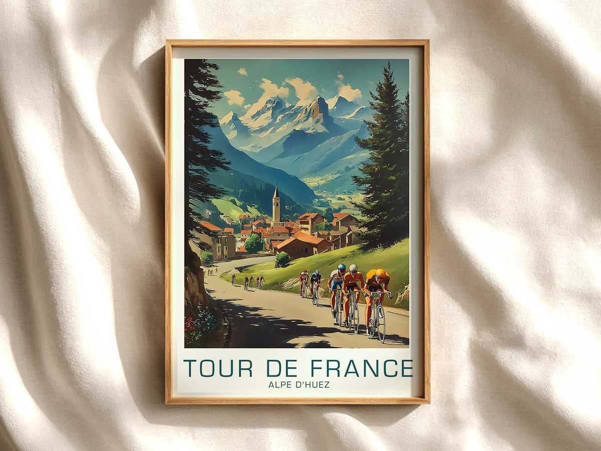
[IMAGE_INSERT_ARTICLE_01]
Collector appeal flows naturally from these signals of age and authenticity. Subtle imperfections—a feathered edge of ink, a slightly misregistered colour block, faint foxing—do not detract; they authenticate. For collectors, those marks are evidence of an object that has witnessed seasons and audiences, and they transform a print from a generic poster into a relic of cultural practice. This is why heritage Tour imagery commands attention: it carries the tactile language of printmaking, the social history of places like Saint-Étienne, and the visible traces of eventful lives.
Design-wise, older Tour visuals tend to prioritise composition and gesture over photographic saturation. A cyclist’s bent silhouette, the line of a road climbing toward a skyline, a municipal crest or simple map vignette—these motifs distill the sport into readable iconography that decorates with clarity. Unlike contemporary promotional graphics that aim to capture ephemeral hype, archival prints offer a steady aesthetic mood. That steadiness makes them versatile: they can anchor a pared-back studio or add cultivated gravitas to a collector’s gallery wall.
Finally, the cultural depth of such an image lies in continuity. Owning a poster tied to a place like Saint-Étienne is a way of carrying forward a shared memory of the Tour: not just the spectacle of competition but the social fabric surrounding it—cafés that cheer riders, cobbles that test them, towns that become temporary stages. For interiors, this translates into authenticity: the print is not merely illustrative but evocative, an object that resonates with history and invites the viewer to inhabit a story.
In short, a vintage Tour poster connected to Saint-Étienne is more than sport on paper. Its archival textures, period iconography and civic references create decorative value rooted in memory and cultural weight. For collectors and anyone who appreciates meaningful wall art, that depth is precisely what transforms a nostalgic image into a lasting piece of interior heritage.