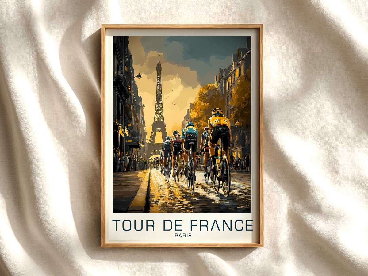
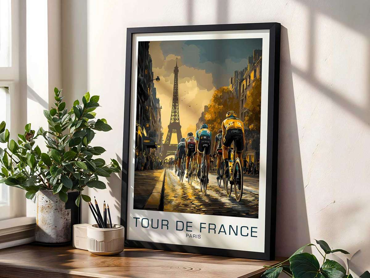
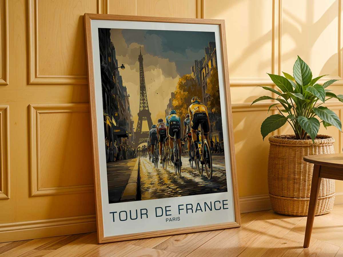
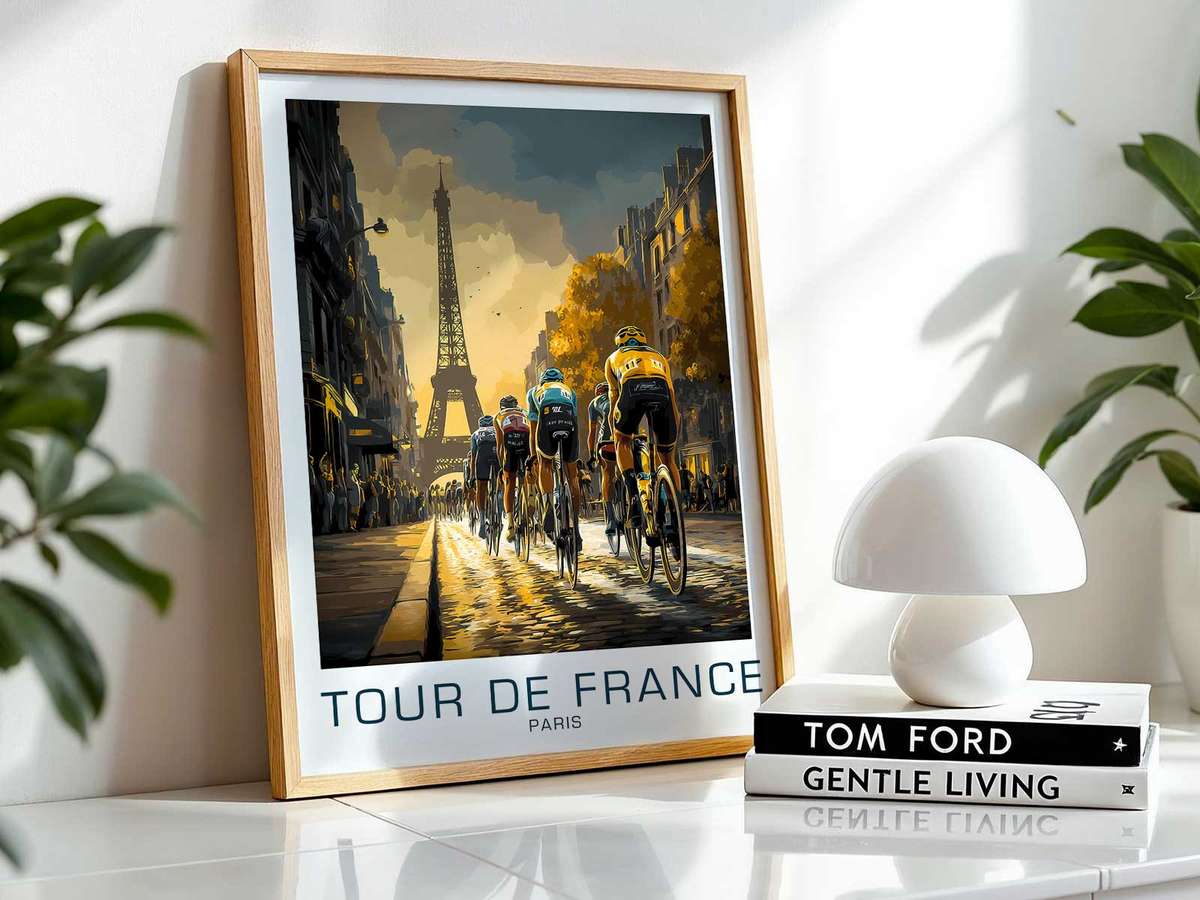
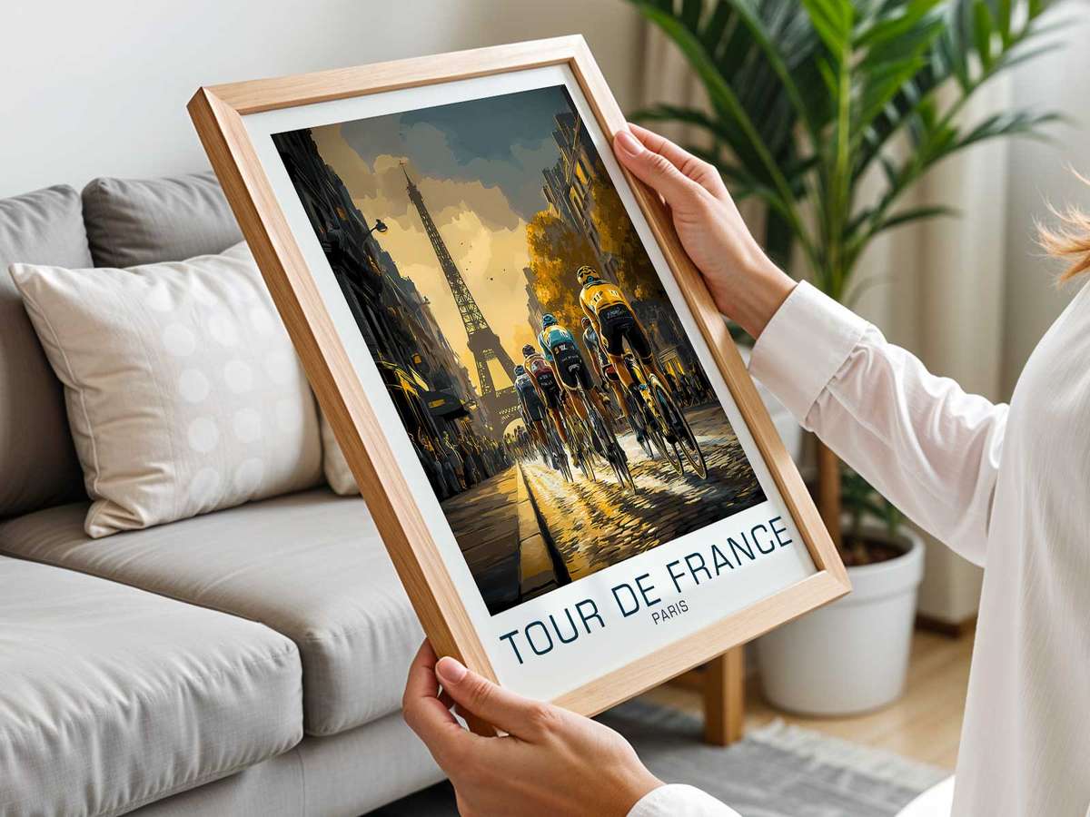
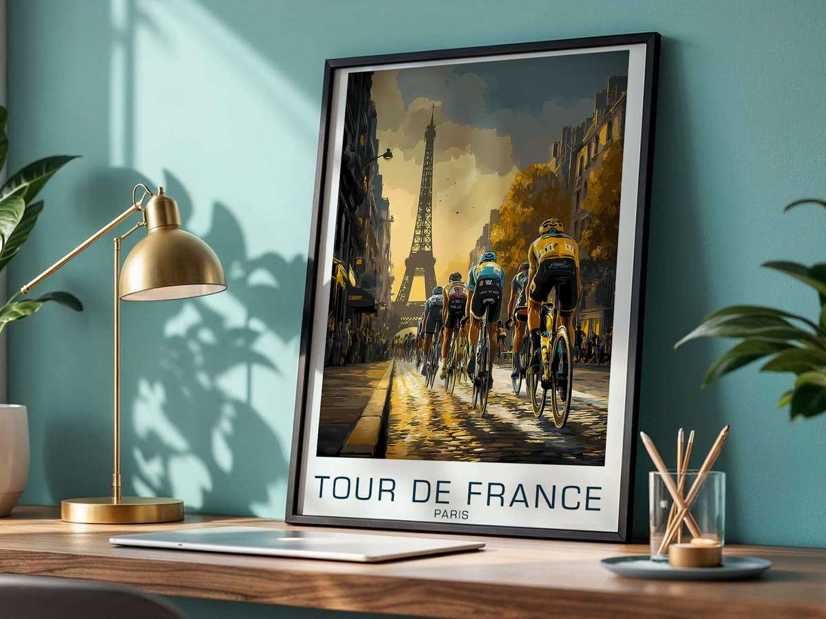
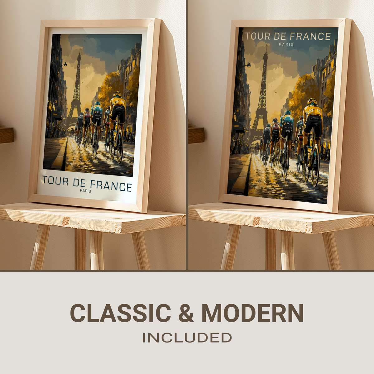
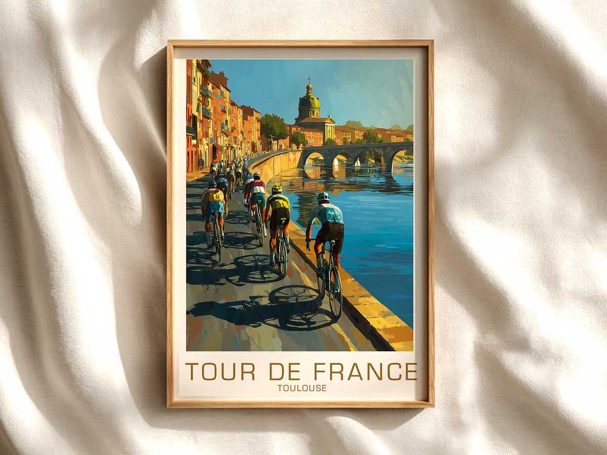
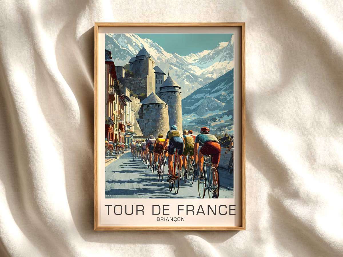
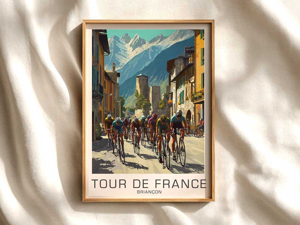
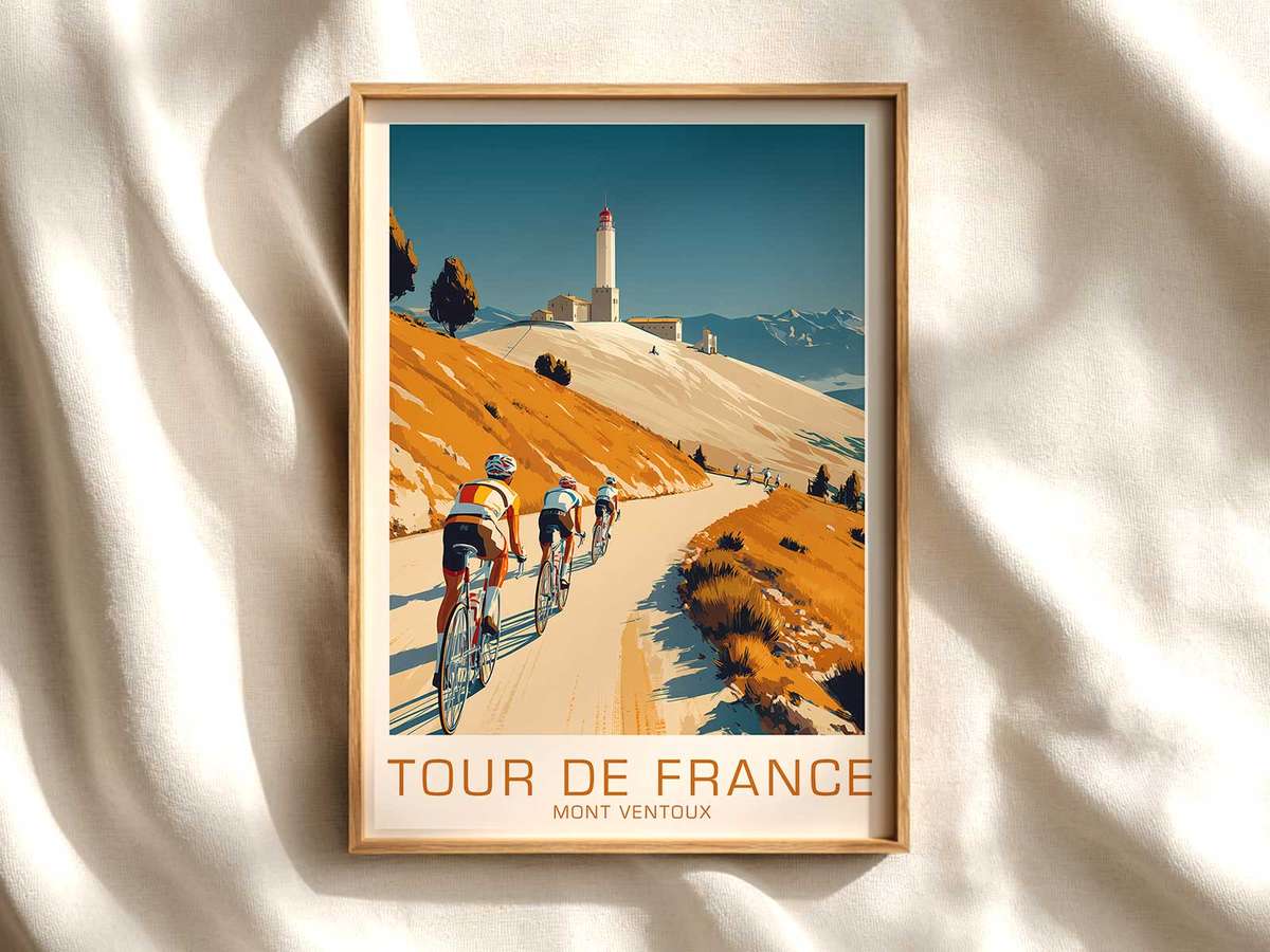
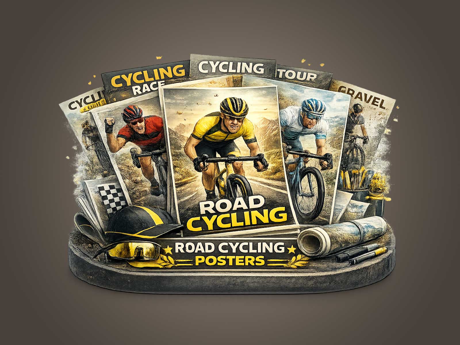
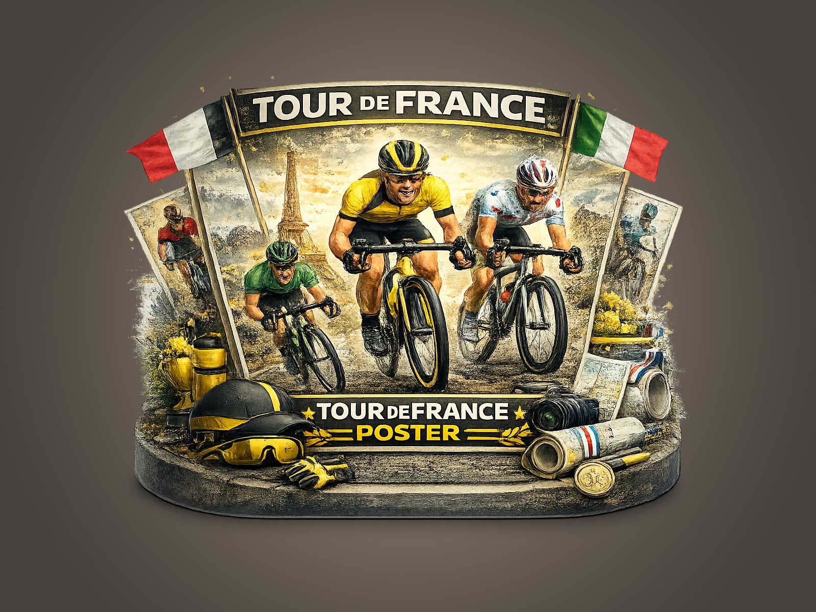
The Champs-Élysées is more than a finishing line; in poster form it becomes a stored memory that reads as completion, civic theatre and classical elegance. A well-composed poster that draws on the avenue’s imagined light — the broad perspective, the aligned trees, the sense of arrival beneath ceremonial façades — does more than show a place: it stages the feeling of the Tour’s ultimate moment. That feeling is why a poster tour de france anchored on Champs-Élysées iconography moves beyond souvenir postcard imagery and becomes something suited to careful display.
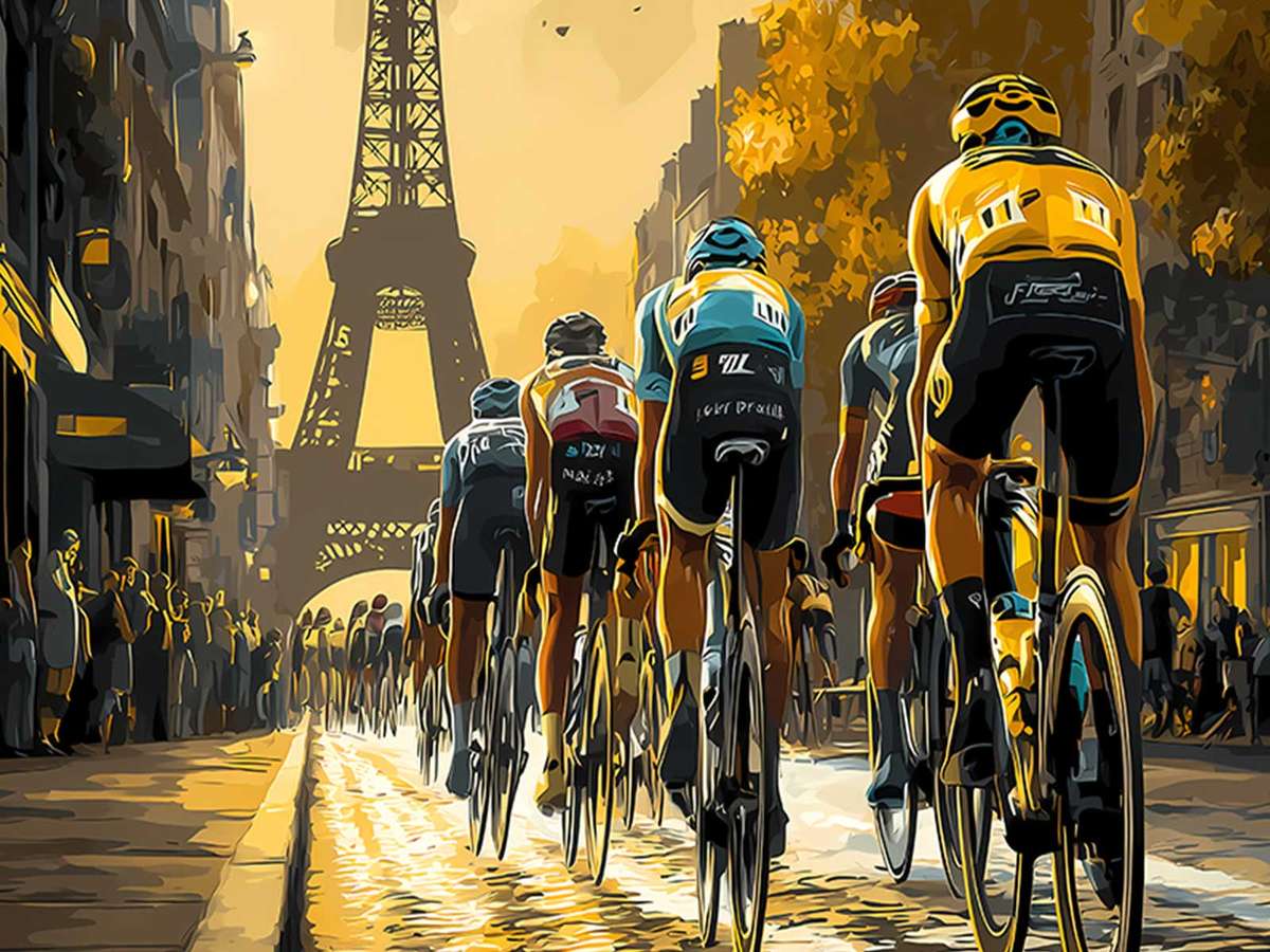
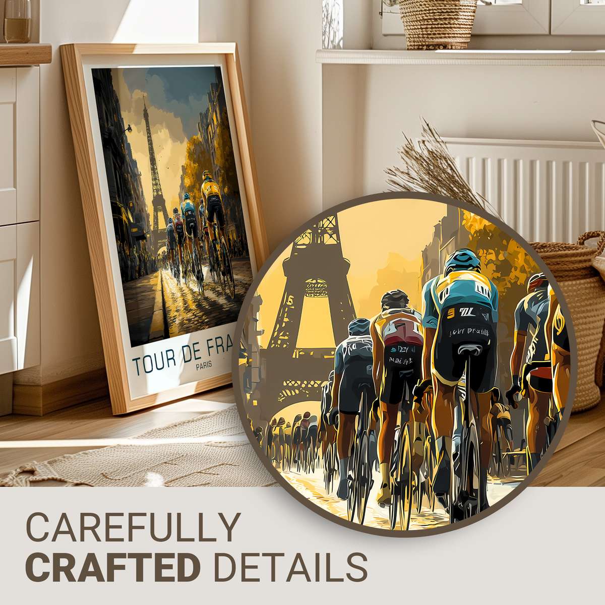
Visually, the challenge and the delight of this subject lie in three tensions: realism versus stylization, detail versus legibility, and period texture versus contemporary print clarity. A poster designed for distance must reduce: cobbles resolve into a strip of tone, spectators become a rhythmic silhouette, and the winner’s jersey reads as a precise block of colour rather than an assemblage of tiny logos. This simplification is not flattening; it is selective fidelity. It preserves the specific cues that communicate race — the angled shoulders of a rider, the thin steel or early alloy bicycle silhouette, a period-minded jersey band — while removing the visual clutter that collapses at a glance from across a room.
Heritage-led imagery gains authority through restrained colour and print warmth. Rather than the saturated exactness of modern race photography, archival-inspired posters favour a reduced palette: creamed yellows that echo offset-paper fade, muted blues and deep ochres that suggest sunlit stone, and the matte darkness of inked blacks to hold form at any distance. These choices simulate weathering and memory without pretending to be a literal historic document. The result is a poster that feels like an object with a past — a wall piece you imagine having been in the same room for decades — which in turn creates a deeper emotional bond than a merely stylized retro graphic might achieve.
[IMAGE_INSERT_ARTICLE_01]
Compositionally, the Champs-Élysées subject rewards a classical approach. A long, narrowing avenue naturally generates converging lines that pull the eye toward the finish: that sense of visual inevitability mirrors the race narrative. Placing a single rider or a small peloton at the vanishing point gives the poster narrative tension — the end of a long effort — while maintaining clarity when viewed from afar. Period typography or hand-minded lettering, used sparingly, reinforces era feeling without competing with the visual story; the title or small caption functions like a museum label, anchoring the scene in cultural memory rather than advertising copy.
Collectors respond to the small, tactile signals that promise authenticity: the silhouette of a predigital bicycle, the geometry of an older frame, the banded simplicity of earlier team jerseys, and the suggestion of print grain in the paper. These are the cues that let the viewer read the image as history-empathic rather than simply fashionable. In interiors — a study, a library, a refined office — such a poster acts like a portrait of endurance. It is not merely decorative; it evokes the discipline of long distance and the quiet grandeur of an urban ceremonial finish.
Ultimately, the visual effect sought in a Champs-Élysées Tour poster is one of distilled ceremony. By privileging compositional clarity, restrained colour, and archival texture, the artwork keeps its presence strong once printed and hung. From a distance the piece reads as a confident, singular moment; close up it reveals the deliberate textures and era details that reward inspection. That duality — immediate legibility and rich, referential depth — is why this kind of heritage Tour imagery transcends the ordinary postcard and becomes a lasting piece of wall art.
Decor note: place beneath soft side lighting or above a reading chair so the printed warmth can harmonise with wood and leather, letting the poster age into the room’s story over time.